Tableau:
CO2 Emissions Dashboard
Using global CO2 emissions data from 2021, I developed a Tableau dashboard exploring the rapid growth of greenhouse gases since the advent of the industrial revolution.
After identifying the relevant datasets, I created three charts:
A map with the current CO2 emissions data per country to show the share of greenhouse gasses emitted from different regions.
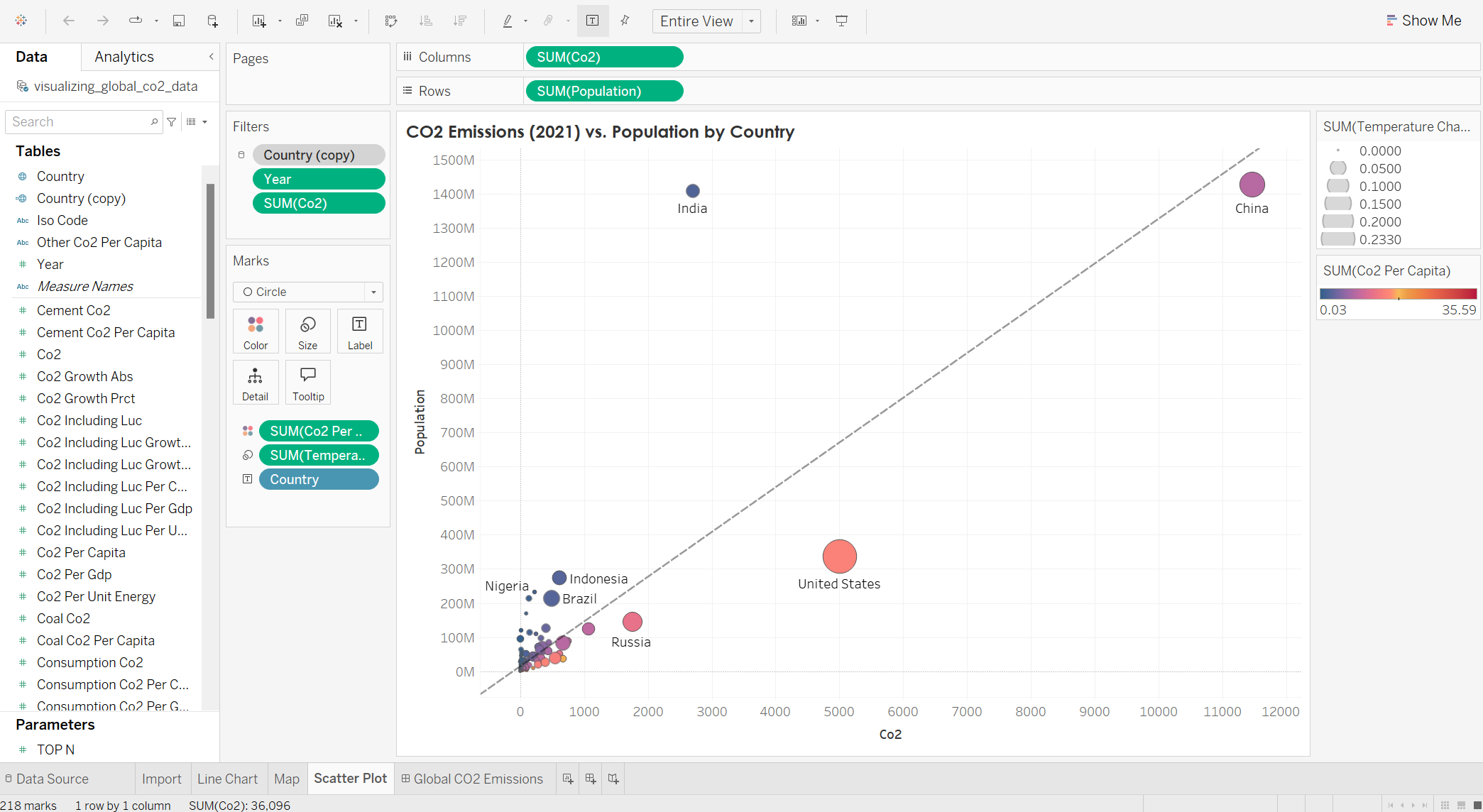
A line chart with the CO2 emissions as a function of the population, showing where each country stands in their greenhouse gas contributions.
A timeline showing the transition of greenhouse gas emissions from the industrial revolution to modern times, showing the changeover when the United States, China, and India became the leaders in CO2 emissions over the United Kingdom and Russia.
If you’re interested in exploring this dataset, you can visit the Tableau page here.


